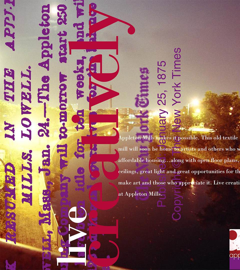
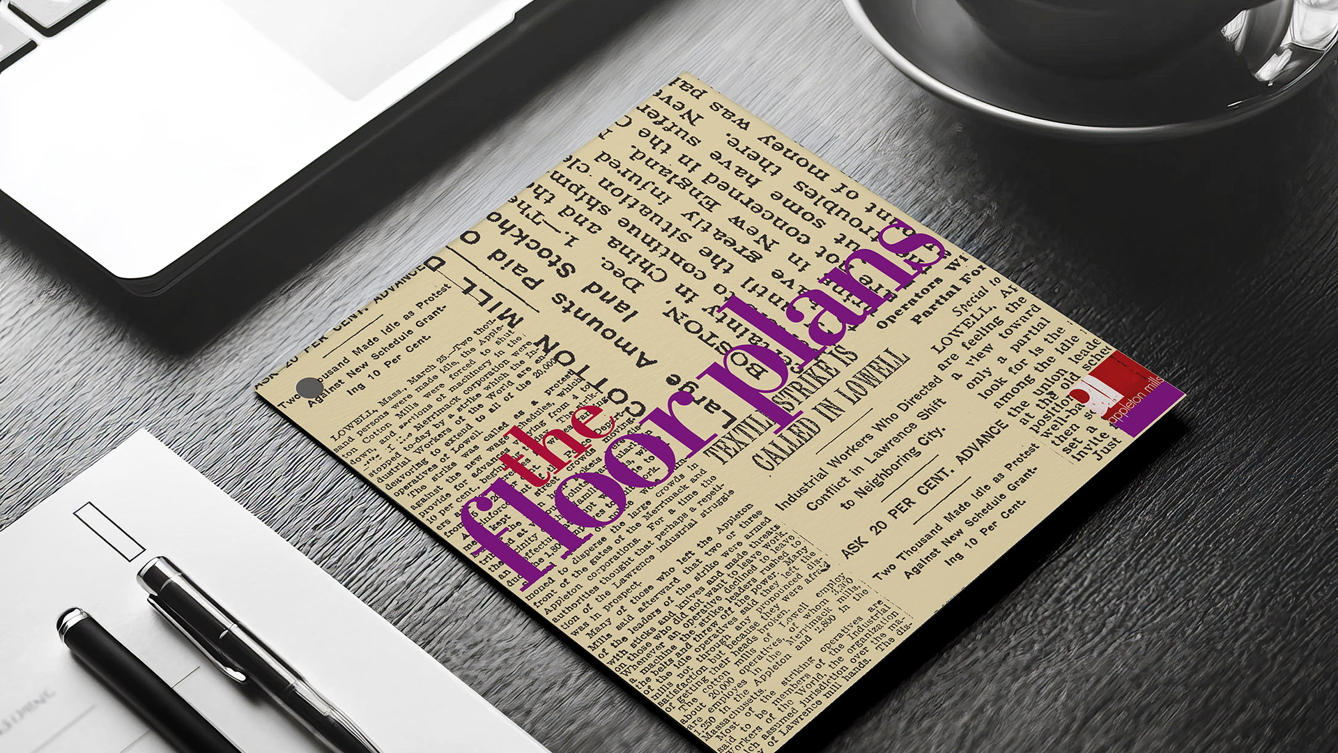
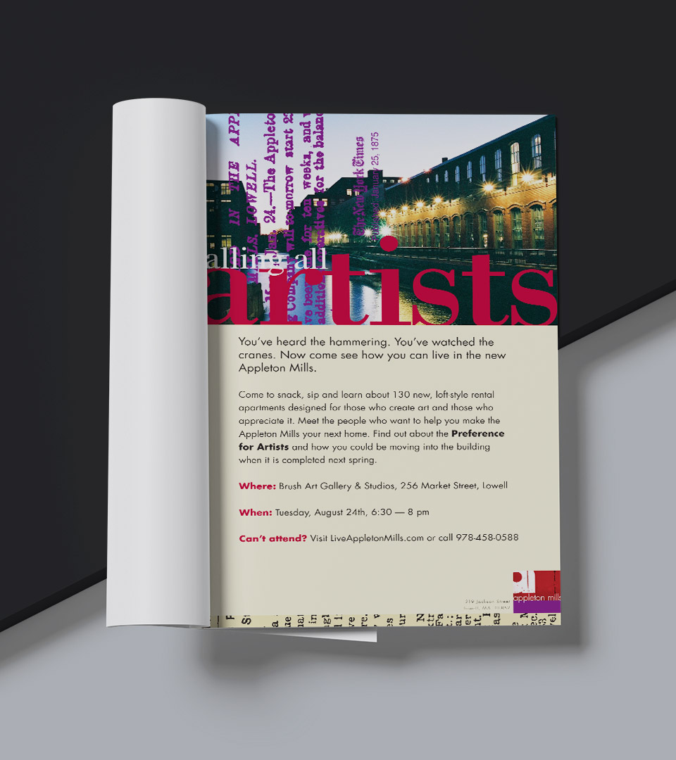
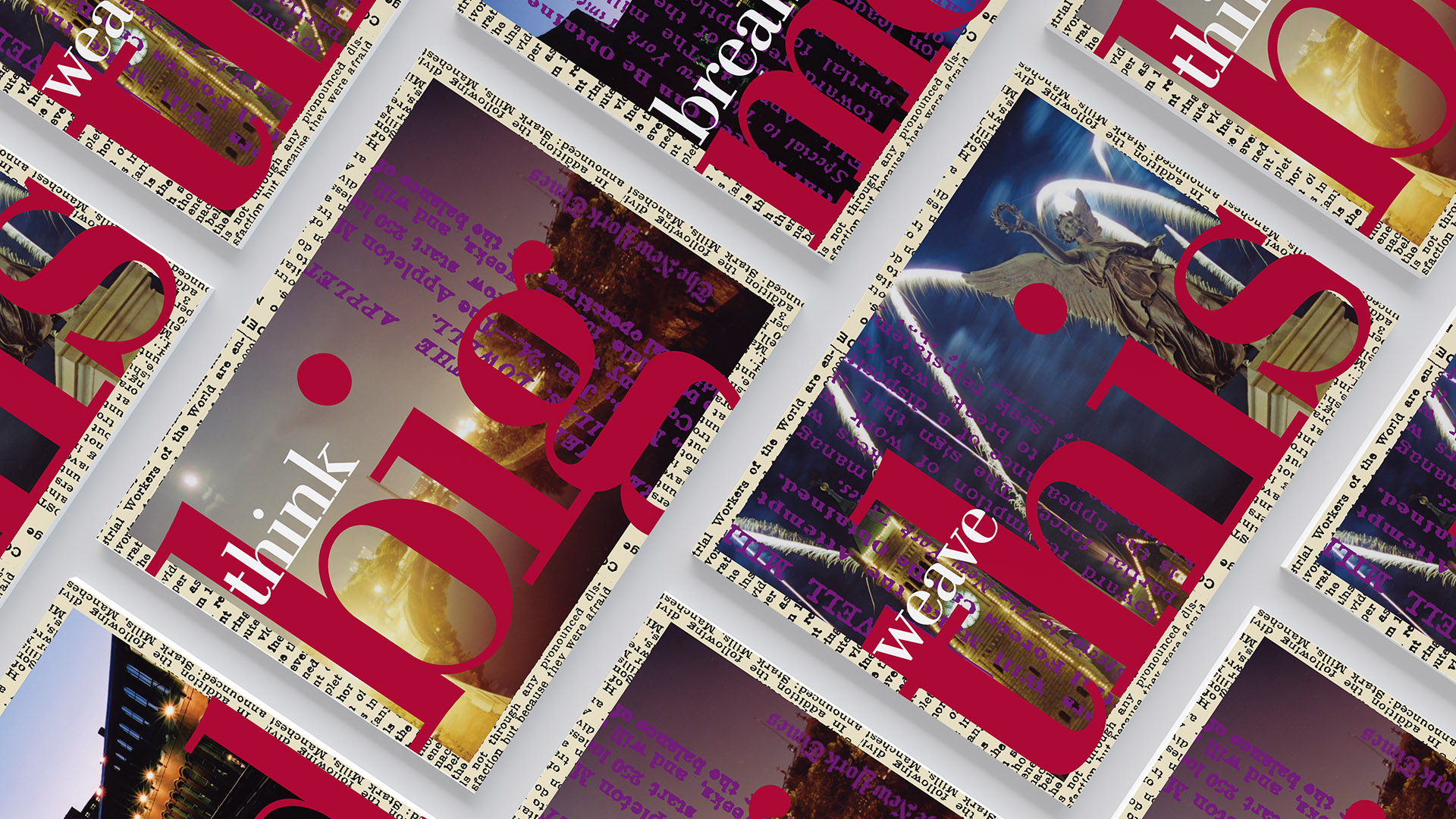
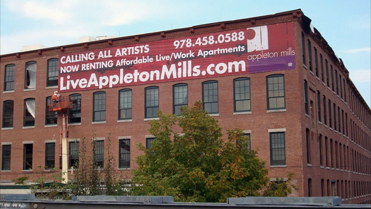
THE SOLUTION
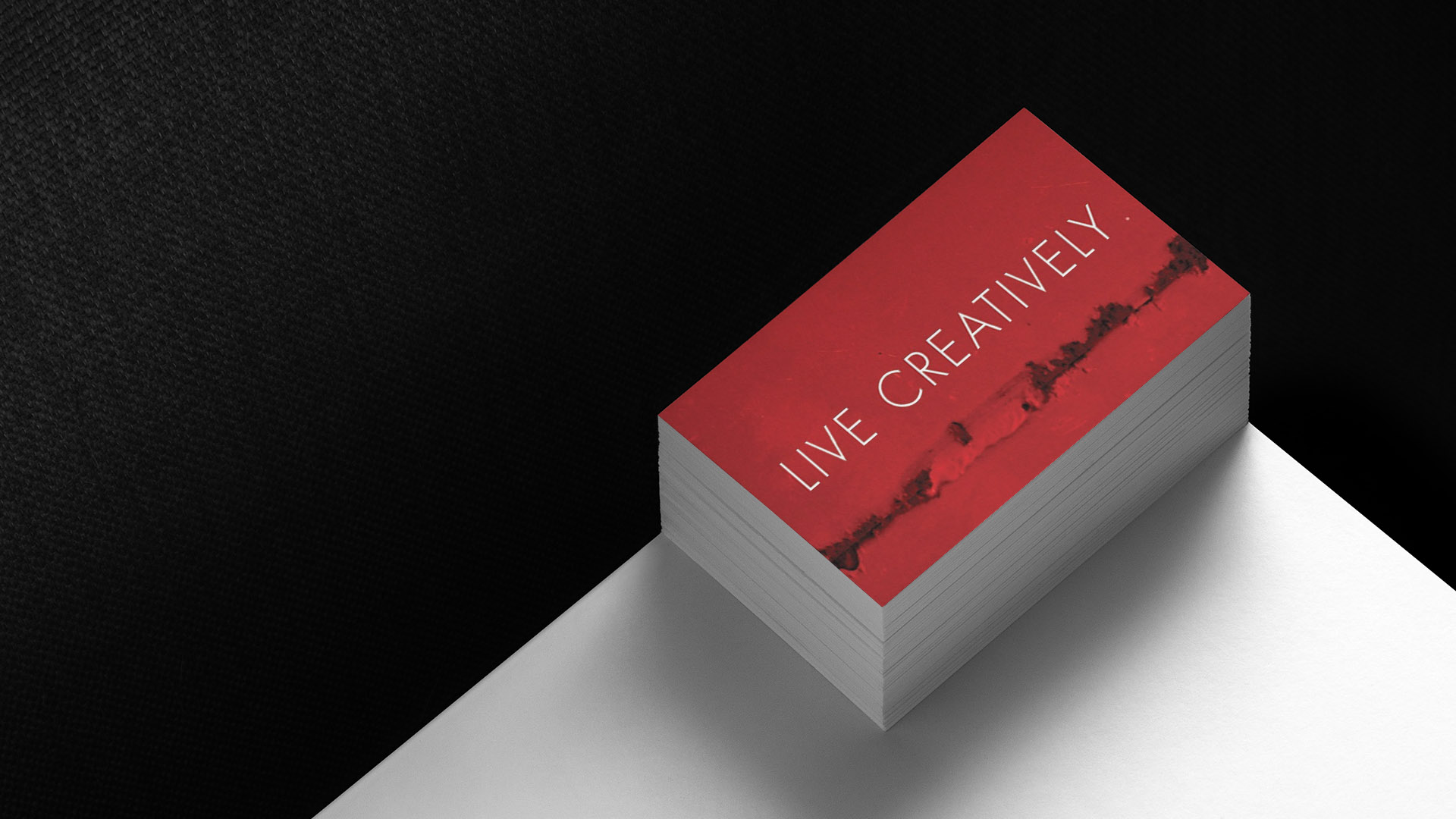
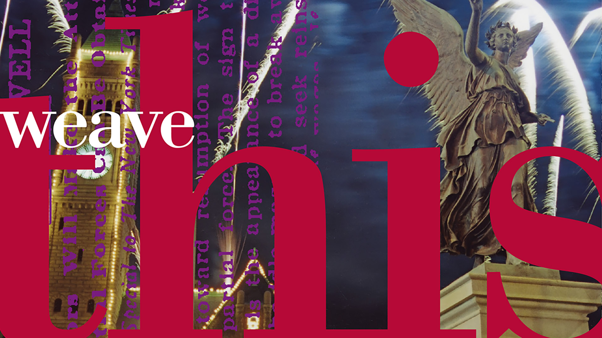
We developed an identity rooted in the mill’s unique architectural details—brickwork, large industrial windows, and the linear rhythm of the original structure. A strong typographic foundation conveys stability and history, while a warm, heritage-inspired palette adds modern softness.
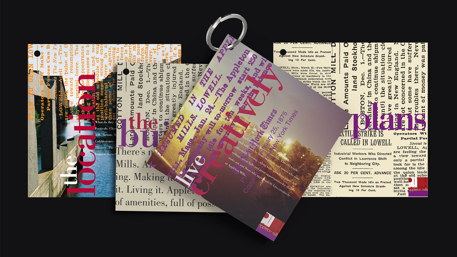
The visual system extends across leasing materials, signage concepts, and print collateral, each piece designed to highlight the building’s restoration and its contemporary amenities. Clean layouts and refined typography bring clarity to the brand, helping prospective residents connect the building’s past with its renewed purpose.
The overall identity is cohesive, respectful of history, and tailored for a community seeking authenticity paired with modern living.