Appleton Mills
A historically inspired brand system for the adaptive reuse of an 1800s textile mill into artist lofts.
Appleton Mills transforms a historic 19th-century textile mill in Lowell into contemporary artist lofts. The project needed a brand that honored the site’s industrial past while appealing to a new creative community. Our identity paired history and modernity, capturing the building’s authentic character and its new purpose as a home for working artists.
Client
Trinity Financial
Industry
Residential / Historic Adaptive Reuse
Services
Brand Strategy, Identity, Advertising, Print, Signage
The Challenge
Appleton Mills required an identity system that could balance two distinct narratives: the grit and history of Lowell’s industrial past, and the modern, creative energy of the artist community moving in.
The challenge was to create a brand that felt rooted in the mill’s textile legacy—without feeling nostalgic or dated—and that communicated both authenticity and affordability in a competitive housing market.
The Solution
We developed a visual identity inspired by the geometry and rhythm of historic textile patterns.
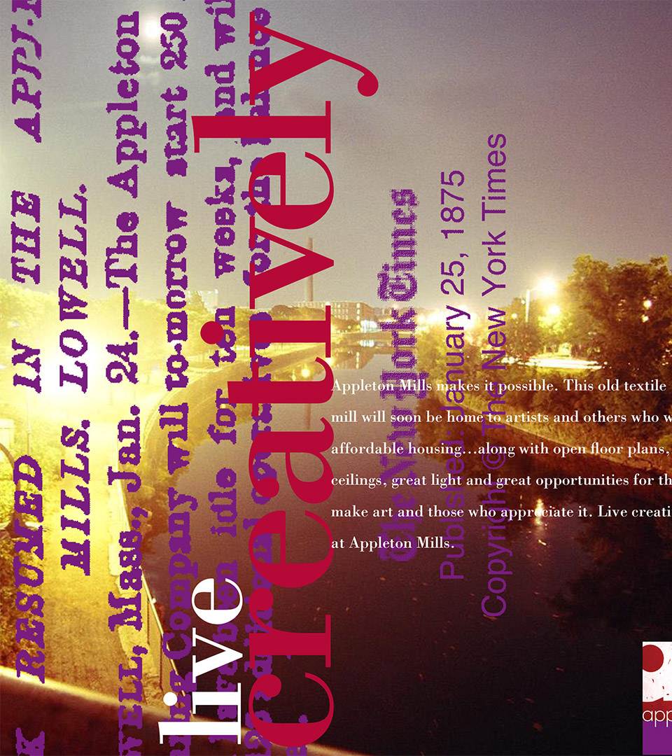
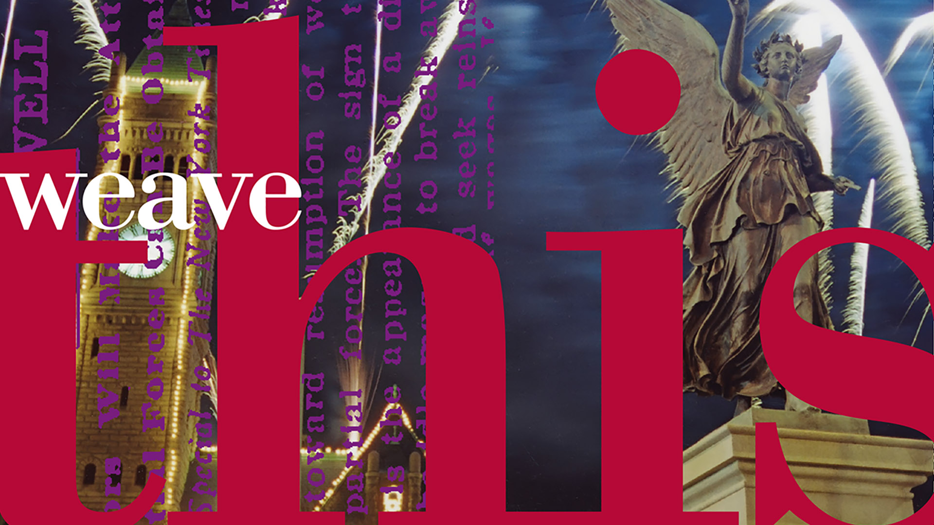
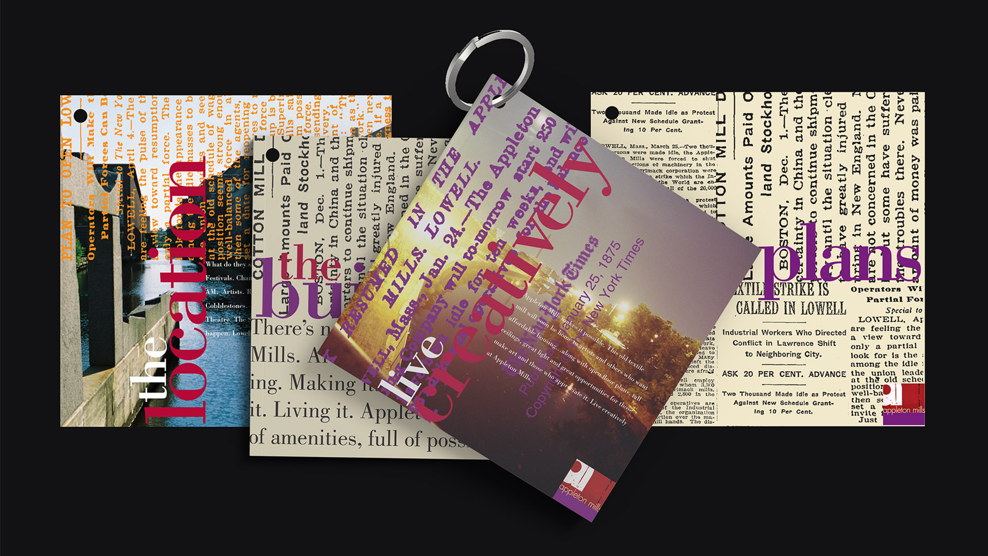
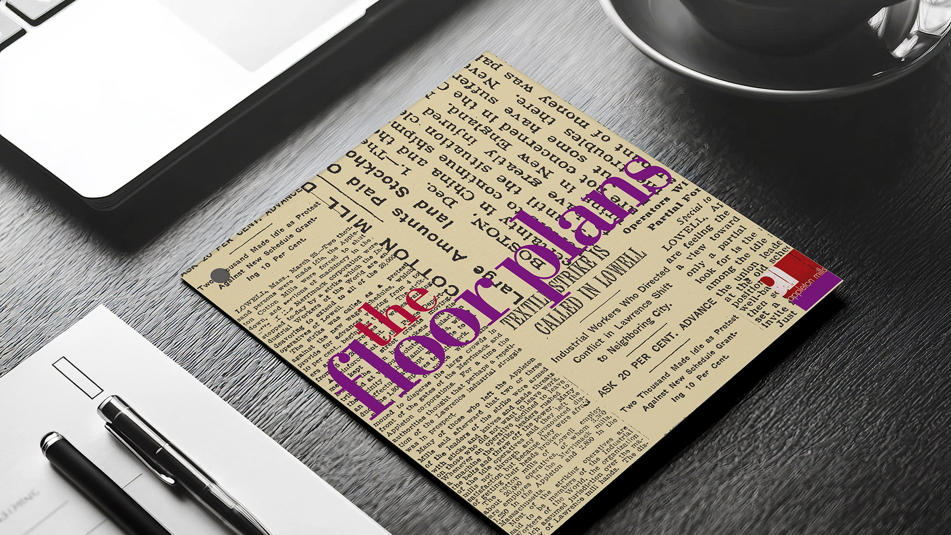
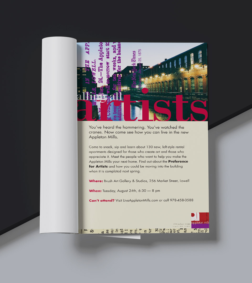
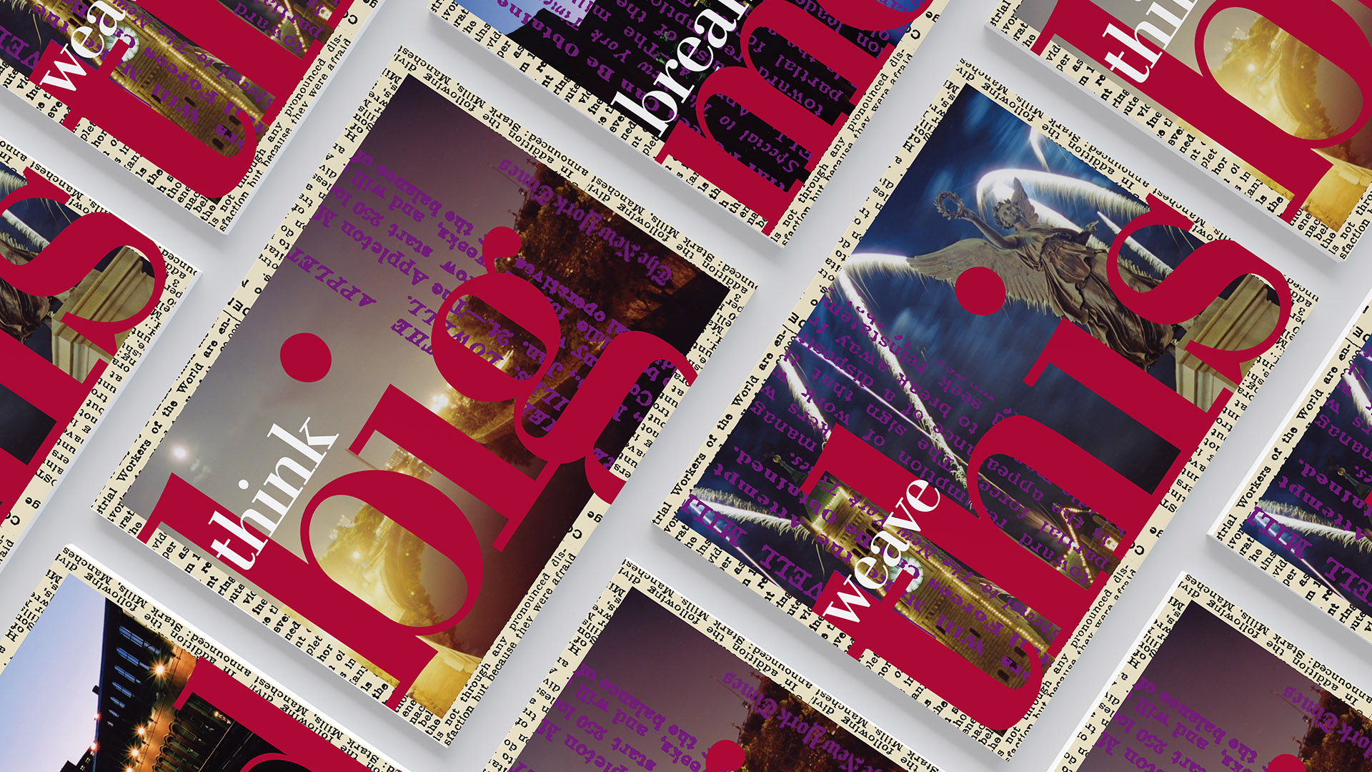
The mark and supporting graphics reference worn structures, and mill-era production methods, translated into a clean, contemporary language.
A warm industrial palette, paired with simple typography and an overlay of 19th century news articles about the mill, created a brand that felt both crafted and modern.
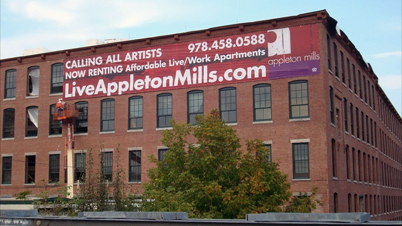
The system extended across a brochure, leasing materials, and signage, giving Appleton Mills a cohesive voice grounded in place, history, and creativity.
“Live Creatively” expresses the building’s transformation from historic textile mill to modern artist lofts, inviting residents to shape their lives with the same spirit of craft and invention. Clean, utilitarian letterforms echo the clarity and functionality of industrial-era signage.
A modern sans-serif logo pairs with textures drawn from distressed wood, faded type, and industrial forms, creating a mark that connects the mill’s past with its contemporary purpose.
A warm, industrial palette inspired by the mill’s original materials—weathered wood, muted neutrals, and archival tones—creates an authentic, grounded look that supports the artist-focused identity.
A layered mix of archival imagery and local photography adds depth and authenticity to the visual system, grounding the brand in its neighborhood and history—key for visibility around artist housing and mill redevelopment.
The brochure was redesigned as modular inserts held by an industrial silver ring, with floor plans stored in a custom pocket for easy use by leasing teams.
We extended the identity into a series of collage-based postcards to reinforce the brand story across print and promotional materials.