A civic identity reimagined for clarity, credibility, and contemporary visibility
Client Back Bay Association
Sector Nonprofit organization / Neighborhood association / Civic institution
Location Boston Back Bay
Discipline Brand Strategy, Brand Identity, Visual System, Website and Development
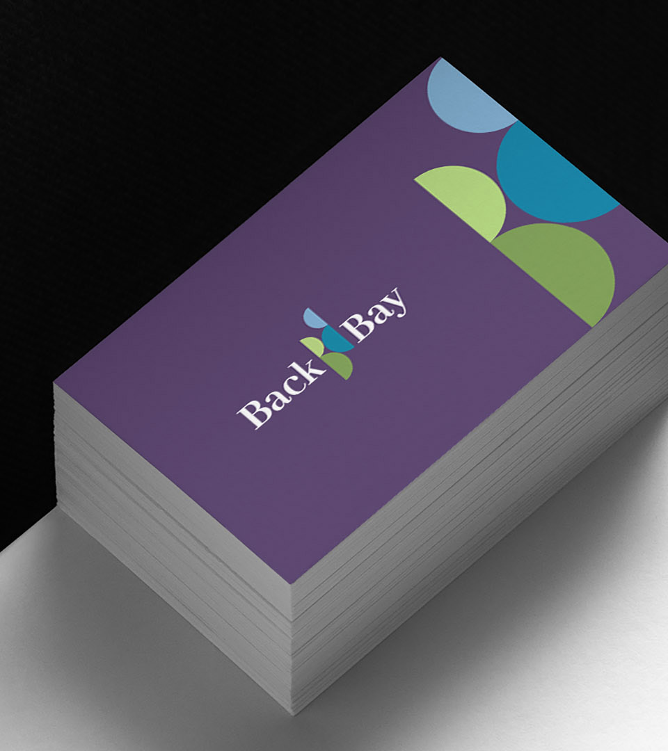
Branding for the Back Bay Association, a Boston nonprofit organization
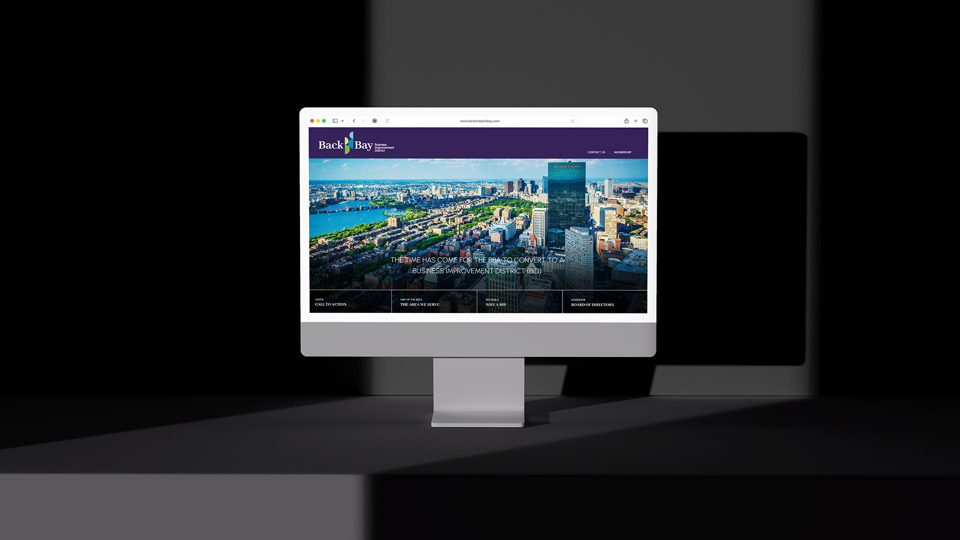
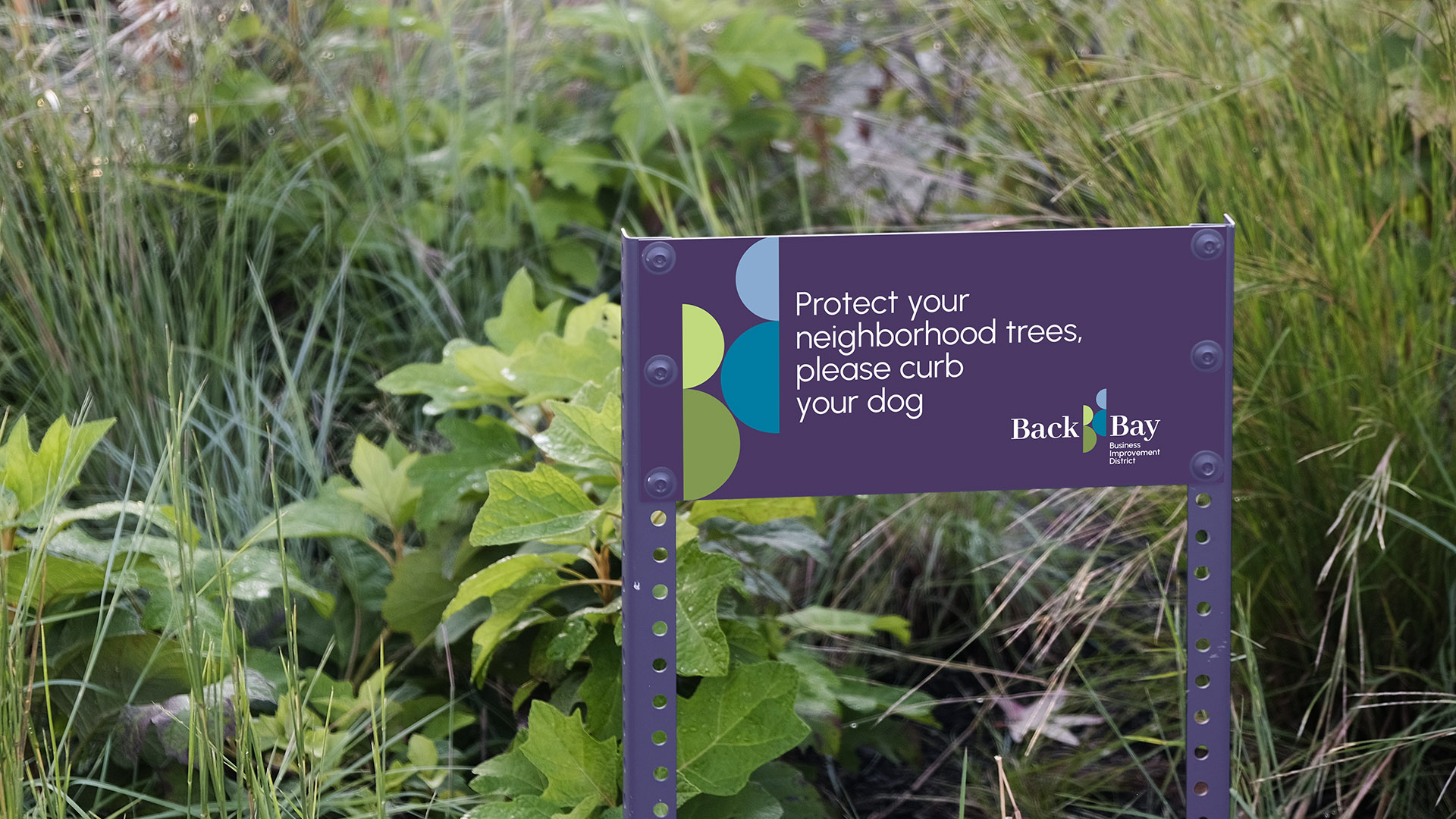
The Back Bay Association is a Boston nonprofit organization representing one of the city’s most established neighborhoods. As the organization explored a transition to a Business Improvement District, it identified the need for a contemporary brand identity that could support a broader civic role and greater public visibility.
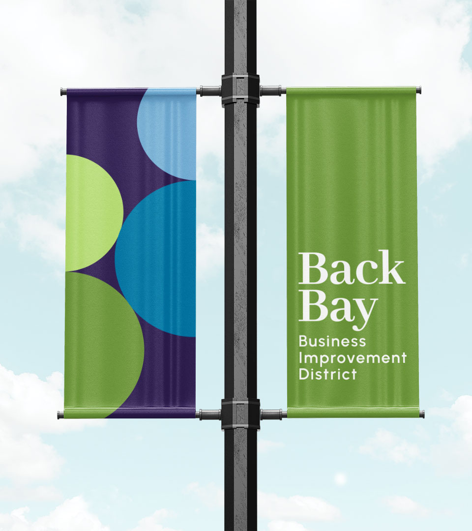
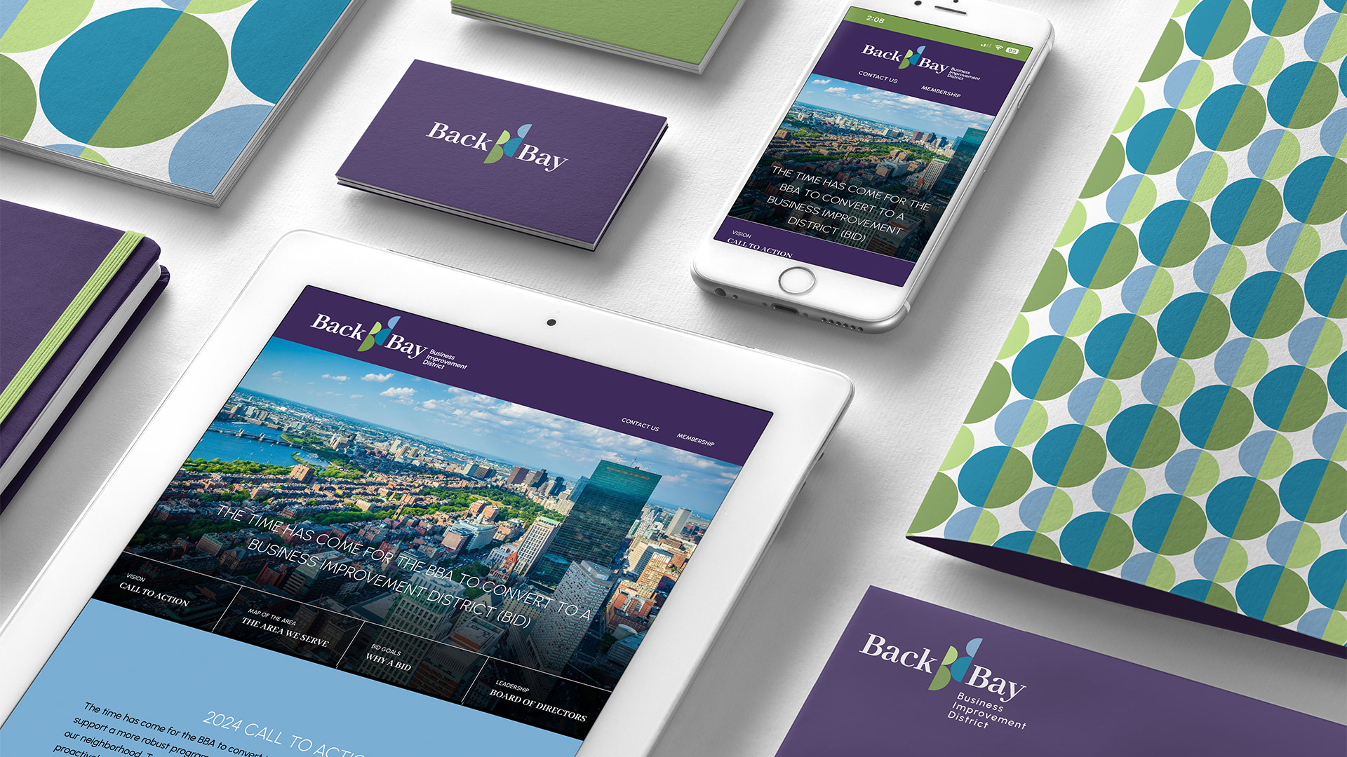
Adams Design developed a flexible branding system designed to signal momentum and readiness for change. Modular forms, strong color, and clear typography replaced a more traditional association identity, creating a visual language that is purpose-driven, accessible, and scalable across communications.
Designed for use across advocacy initiatives, events, signage, and neighborhood programming, the identity reflects an organization rooted in stewardship while clearly oriented toward action, progress, and long-term impact.
The new identity provides the Back Bay Association with a clear, contemporary visual system that supports its evolving role within the neighborhood. Designed to scale alongside the organization’s transition to a Business Improvement District, the branding strengthens visibility, unifies communications, and reinforces credibility across advocacy, programming, and public engagement. The result is an identity that respects the Back Bay’s historic character while clearly signaling progress, collaboration, and shared investment in the future.