Larkwood

A nature-inspired brand identity for a new riverside condominium community

Larkwood condominium branding featuring a nature-inspired logo for a riverside residential community.
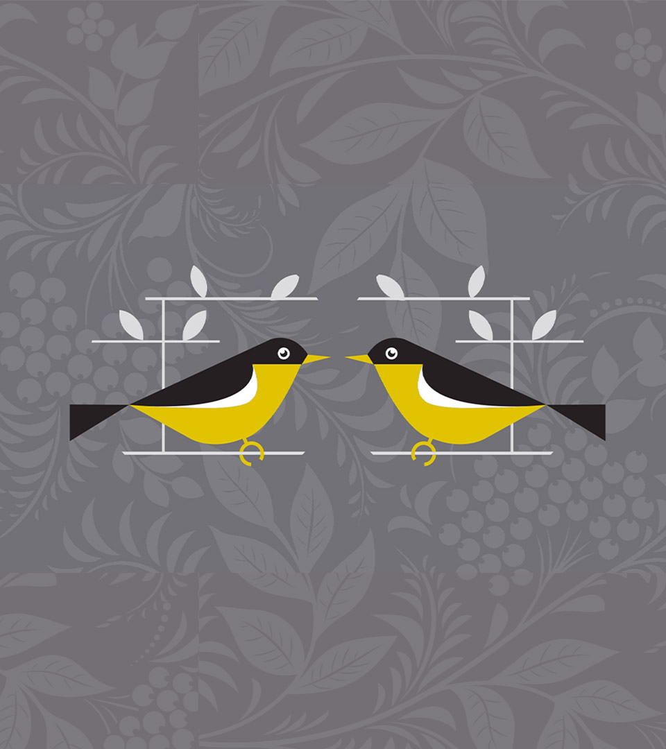
Larkwood brand pattern and bird icon inspired by woodland and riverside surroundings.

Client
Thorndike Development

Sector 
Residential Real Estate

Location
Raynham, MA

Discipline
Brand Strategy, Naming, Brand Identity, Visual Language, Print Materials, Signage, Website

Awards
2024 Prism Awards Best Logo

Larkwood logo applied to a botanical pattern reflecting the community’s natural setting.

About this project

Larkwood is a new condominium community set along a river and surrounded by woodlands, offering a rare opportunity to brand a place where nature shapes daily life. Designed for families and buyers seeking more space, fresh air, and modern convenience, the identity needed to feel optimistic and contemporary while remaining grounded in its natural setting.

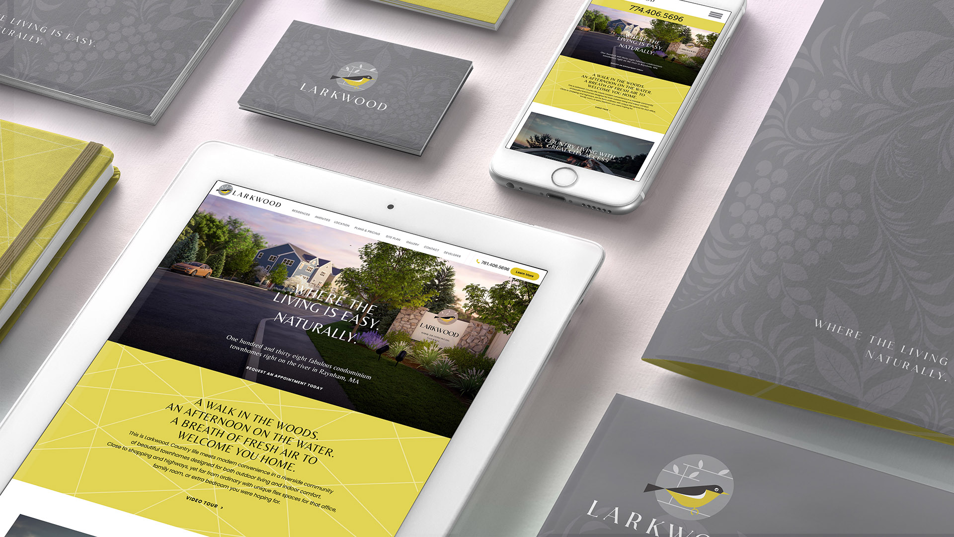
We developed a visual system centered on the idea of nature made modern. The Larkwood name blends lightness and freedom with a sense of permanence and craft, while the logo’s geometric bird form expresses ease, movement, and connection to the outdoors. A refined palette of warm grays and sunlit yellow reflects both calm and energy, paired with clean typography and a subtle botanical pattern that adds texture without feeling rustic.

Across print, signage, and digital applications, the identity positions Larkwood as a place defined by simplicity, clarity, and an effortless way of living close to nature.

A mix of soft gray neutrals and a vibrant yellow accent, reflecting bright sunlight against natural surroundings and giving the brand its signature energy.

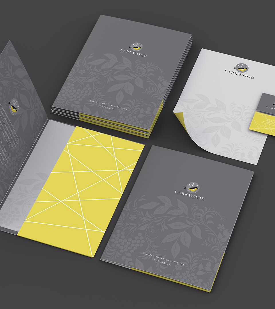
Larkwood branded stationery designed for a residential condominium development.
Branded presentation materials for Larkwood, a riverside condominium community.
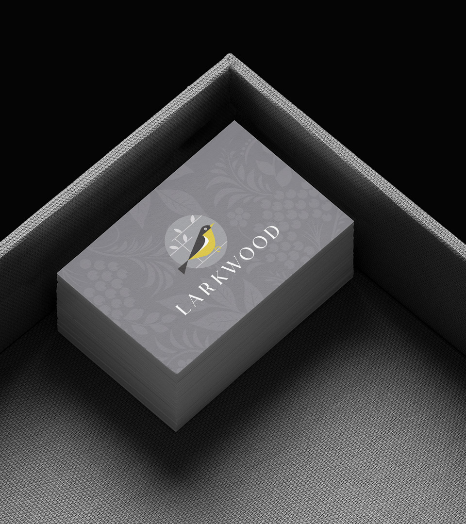
Complete Larkwood brand identity applied across print and digital materials for a residential community.

The identity gave Larkwood a clear and differentiated presence in a market with few comparable new-construction offerings. The bright, optimistic system highlighted the site’s natural advantages while communicating a modern, approachable lifestyle, helping the community enter the market with confidence, warmth, and a strong sense of place.


Adams Design
20 Park Plaza
Boston, MA 02116

Let's Talk!