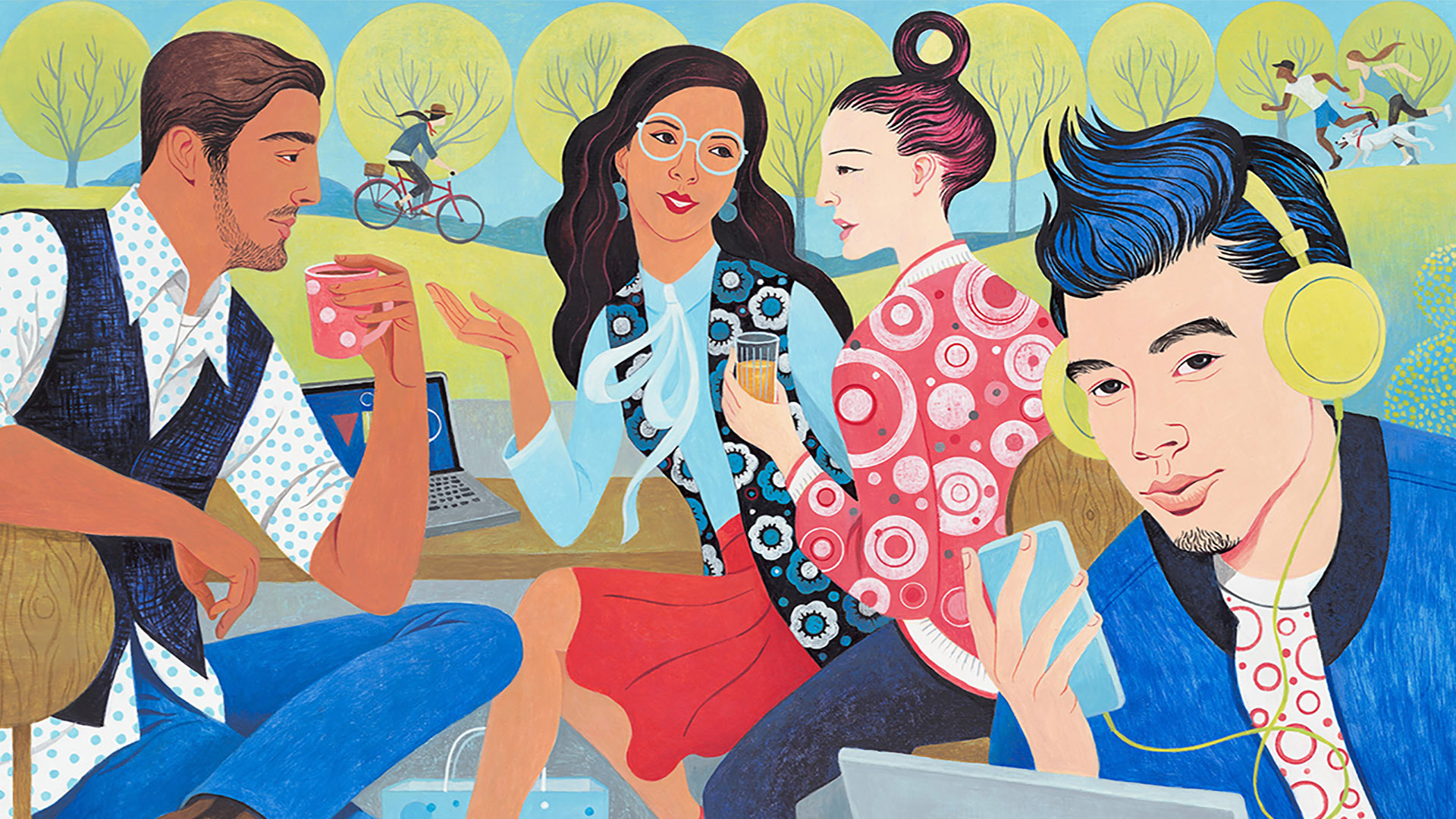
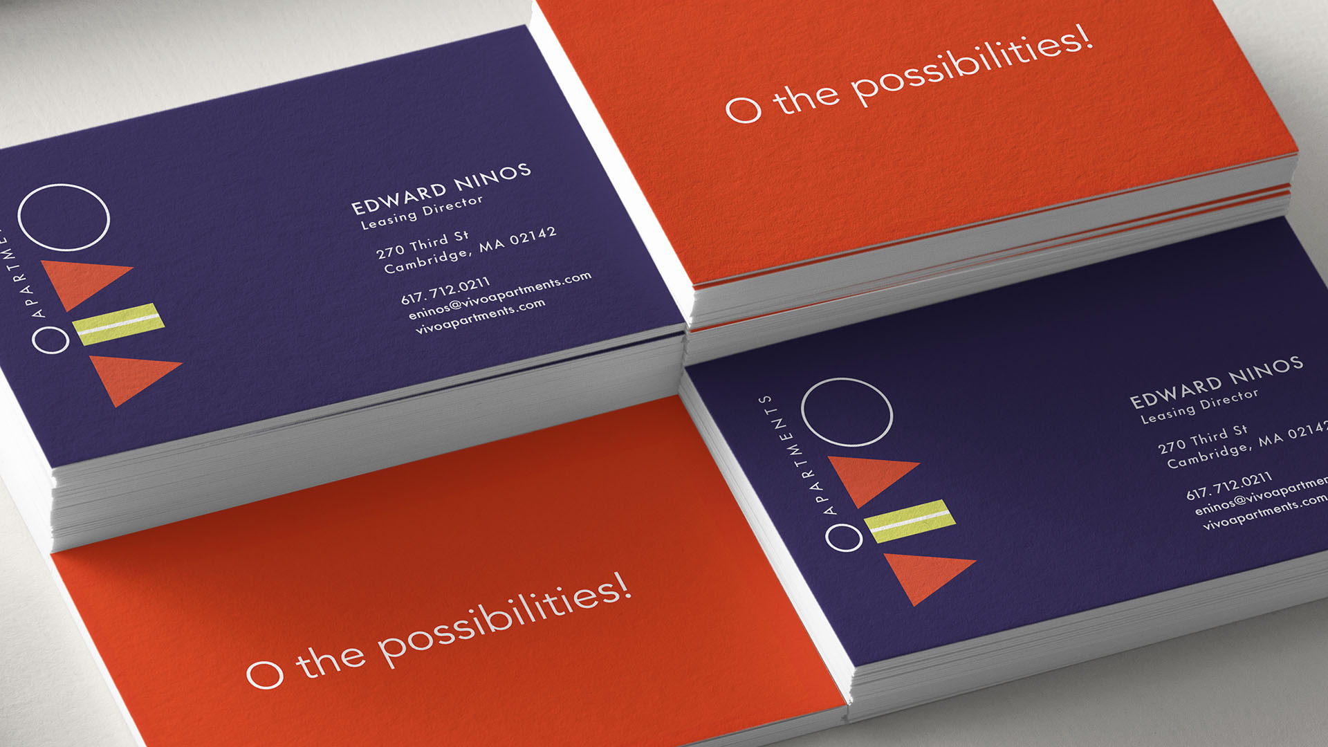
Inspired by the shapes of medical flasks and beakers, we created a brand identity that was bright, fresh and attention-getting. The illustration pulled all those colors in and then reinforced the O idea within the painting.
The tagline we developed (O the possibilities!) is punctuated throughout the branding graphics.